
Design and art shows are my guilty pleasure—though I never feel guilty watching them. There’s something about the mix of pressure, colour, and unexpected beauty that always makes me happy. One evening, while rewatching Interior Design Masters, Matthew Williamson appeared as guest judge. Bold colours, layered textures, botanical bursts. Effortless confidence. I liked it.
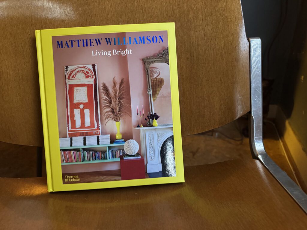
Matthew Williamson is an award-winning British designer known for his fearless use of colour and pattern. Having spent over two decades leading his eponymous fashion label, he built a reputation for vibrant prints, exotic details, and that unmistakable signature. Before interiors, there was fashion: collaborations with Zandra Rhodes, Marni under Lucinda Chambers; a standout debut at London Fashion Week in 1997 with Electric Angels, worn by Kate Moss and Helena Christensen. Then came a period as Creative Director at Emilio Pucci. His designs graced the wardrobes of icons, and his prints landed on everything from Smythson diaries to Swarovski stones to Coca-Cola bottles. Around 2013, he shifted towards interiors, starting with wallpapers and fabrics for the British company Osborne & Little. Since then, his world of design has expanded into homeware, rugs, lighting, and full interior design projects for hotels, restaurants, and private residences. The pivot never felt forced—it felt like a continuation of a story, just in a different room.
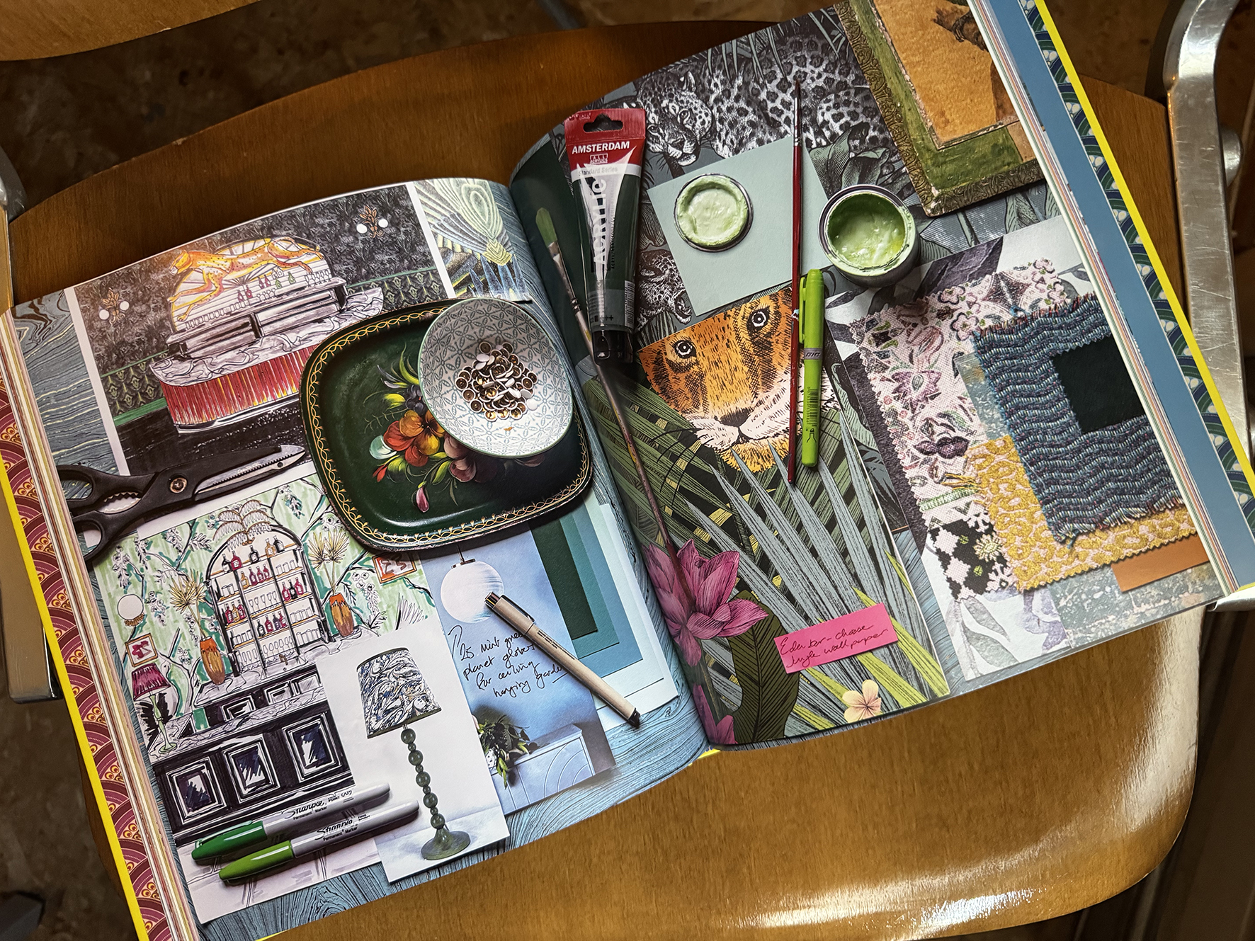
A few days after many TV episodes, I saw the book Living Bright at a friend’s place. Just lying there, casually fabulous. I flipped through it, and something again clicked. Back home, with a cup of matcha in hand, I reached for The Kinfolk Home—already sitting quietly on the table.
Living Bright is more than a style guide—it’s part memoir, part manifesto for living with confidence, colour, and especially joy. He’s not about colour theory; he’s about emotional palettes. About finding your own “style DNA” through twenty questions that go deeper than Pinterest: What scent moves you? What memory lingers? What decade do you daydream in?
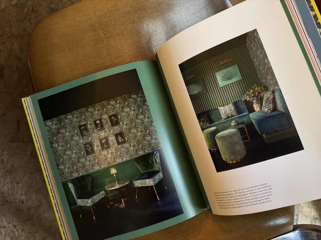
His interiors beam. Layers of green-on-green bedrooms, tone-on-tone plaster-pink walls, patterned cushions that somehow feel like they’ve always belonged there. The book reads like walking through his home—rich, personal, unapologetic.
“Embrace the colours that resonate most strongly with you and how you want to live.”
—Matthew Williamson, Living Bright
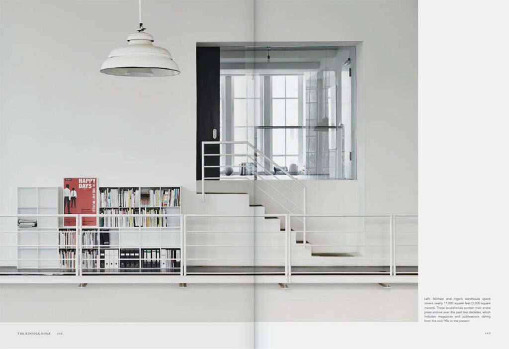
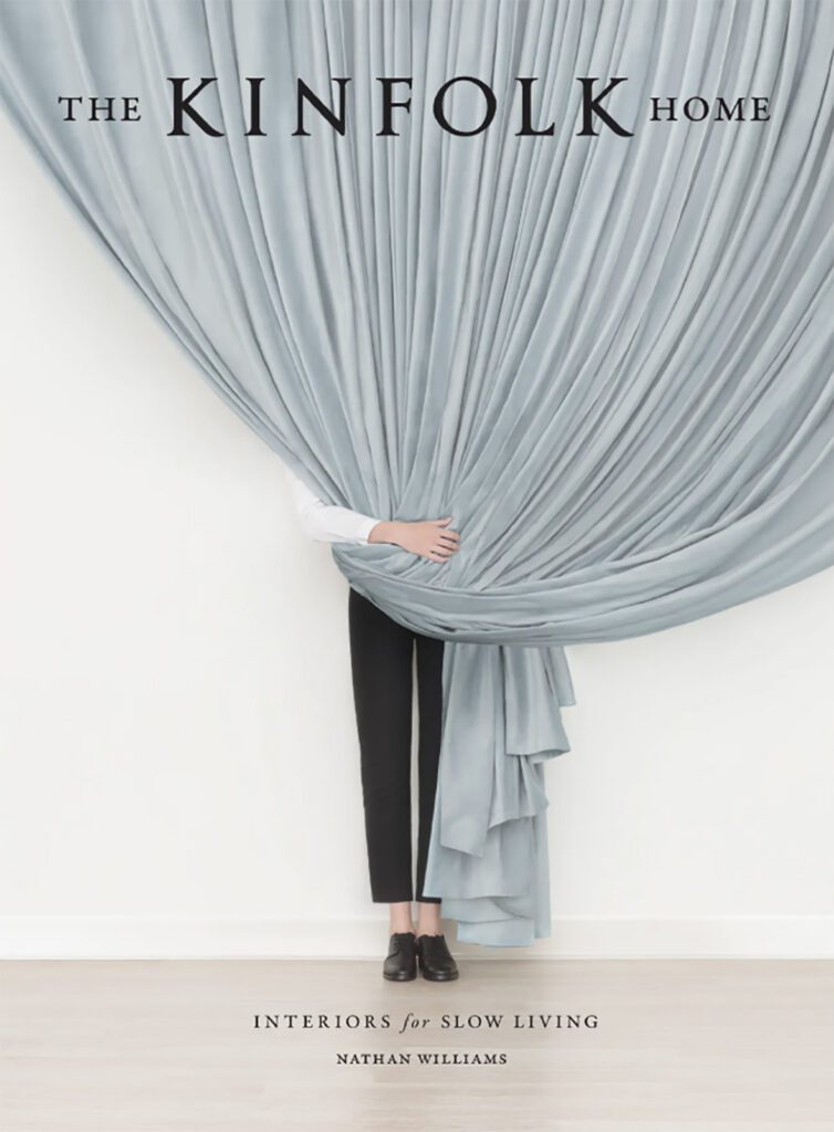
The Kinfolk Home, by contrast, moves at a different pace. Curated by Nathan Williams, founder of Kinfolk, the book feels like a sequence of quiet pauses. The homes are styled—but not to impress. They hold a kind of spaciousness that feels reflective, in tune with the people who live in them and how they move through their days.
Where Living Bright pulses with expressive colour, Kinfolk offers space. Space to breathe, to notice what’s there and what’s been intentionally left out. Photographed across continents—from Scandinavia to South Korea to upstate New York—each interior reflects a shared philosophy: thoughtful living, rooted in clarity. A muted palette, simple objects, and natural textures guide the rhythm. Nothing shouts, but everything has presence.
“At the heart of each living space is an aesthetic shaped by the dweller’s idea of what is essential.”
—Nathan Williams, The Kinfolk Home
Styling interiors isn’t so far from styling fashion or beauty. Some lean into eclecticism, others prefer stillness and restraint. I often find myself in between—drawn to opposites that speak to each other. There’s something grounding in rooms that reflect contradiction: tension and ease, memory and aspiration. A velvet sofa next to unfinished wood. A bold artwork on a blank wall. It only works when it’s done with heart. And while Williamson’s interiors are joyfully maximal, they remain unmistakably British. Modern florals, rich colour stories, a kind of controlled opulence. His background in fashion shows—in the way he composes a room, how a print lands just right, how a palette pulls you in. I’ve always admired his intuitive understanding of colour—sophisticated, generous, and personal.
Kinfolk offers something else entirely. It’s not just about furniture or palette—it’s about presence. It brings in that yin and yang: softness, balance, quiet strength. Sometimes I wonder—do the people who choose these kinds of spaces already carry that stillness within them? Or do their surroundings slowly invite it in?
Maybe that’s what I’m most drawn to: not the extremes, but the gentle meeting point. The place where two different ways of seeing can coexist. A home—like a look—that’s grounded but open. Expressive but composed. Rooms that hold energy, without ever trying too hard.
As someone who lives by abundance in style, I’ve always been drawn to contrast. Not just in aesthetics, but in feeling. I borrow from both worlds—the layered and the light—and somewhere in between, I find my own rhythm.
From vibrance to restraint, velvet to linen.
Each with its own kind of harmony.
Each shaping how it feels to be at home.
Discover more:
www.matthewwilliamson.com
www.kinfolk.com
Photos taken by author and courtesy of Matthew Williamson and Kinfolk.


